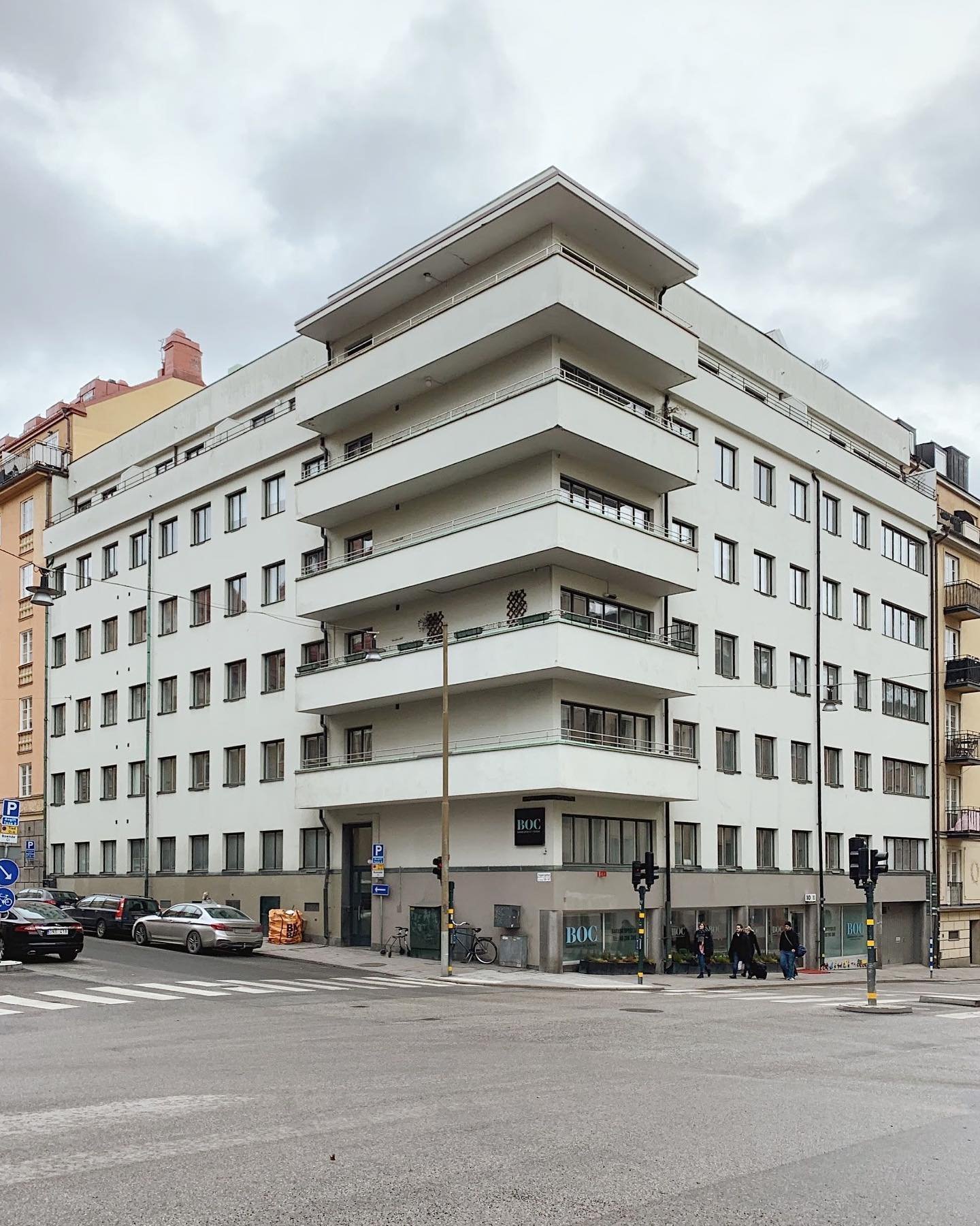
Welcome to the fabulous 1930s, a time of incredible innovation and design! This period saw the rise of functionalism and modernism, which inspired architects and designers to create stunningly unique and modern buildings and interiors. Today, we're going to explore some of the most exciting design elements of this era, both inside and out!
1930s exterior. Photo taken from Arkitekturutflykter
Exterior Design
Let's start with the outside of these modern marvels! The buildings of the 1930s were known for their clean, straight lines and cube-shaped facades. These were often covered in light-colored plaster or thin standing wood panels, which gave them a sleek and minimalist look. And don't forget about the roofs! Flat roofs were all the rage, and sometimes, they were even clad in copper or sheet metal.
1930s exterior. Photo taken from Arkitekturutflykter
One of the most distinctive features of these buildings was the long horizontal window bands. These windows were often frameless and made up of large panes of glass without any mullions or transoms. This allowed for maximum natural light to enter the building and created a seamless connection between the interior and exterior spaces. The emphasis was on the horizontal rather than the vertical, and sometimes the windows even ran around the corners of the building!
The front doors of these buildings were also a unique feature. They were often wooden with circular glass windows, adding a touch of elegance and sophistication to the overall design. And let's not forget about the curving balconies, often running around the corners of the building, with corrugated-iron balcony frontage. The lines of the building were emphasized, and everything had a purpose!
Interior Design
Now let's step inside these incredible buildings and take a look at the interior design elements that made them so special. One of the most notable features was the flooring. Parquet flooring in various patterns, tongue-and-groove floorboards, and linoleum were all popular choices. These added texture and depth to the space, while still maintaining the overall minimalist feel.
The doors in these buildings were also unique. Sliding doors and flush doors of lamella construction with a crisscross pattern were often used. Masonite was a breakthrough material at the time and was used to create smooth internal walls and light wallpapers or mural wallpapers that, from a distance, resembled a rough plastered wall. The interior walls and woodwork were light in color, but rarely completely white, often featuring muted pastel shades.
When it comes to furniture, functionalism, Bauhaus, and International style influences were all the rage. Tubular metal furniture and linear forms dominated, with materials like Bakelite, chrome, stainless steel, and colored glass being used extensively. And let's not forget about the bathrooms and kitchens! Bathrooms were simple and had most of today's features, with smooth white tiles on the walls or painted plywood, and black-and-white chessboard floors. And in the kitchen, flush cupboard doors with a slightly rounded profile, metal-sprung door latches, simple knobs, and metal cup handles on drawers were all popular choices.
In Conclusion,
The 1930s was an exciting time for design and architecture. Functionalism and modernism inspired architects and designers to create buildings and interiors that were sleek, modern, and functional. From the clean lines and cube shapes of the building facades to the long horizontal window bands and unique front doors, every element of these buildings was carefully thought out and purposeful. The interiors were just as impressive, with unique features like parquet flooring, lamella construction doors, and tubular metal furniture. The 1930s may be gone, but the influence of this era's design is still felt today!


